Our brand book
At K2 Indx, our brand expresses our purpose: to design clarity and deliver confidence. Every element of how we show up, from the words we choose to the visuals we use, should demonstrate care, precision and good judgement.
This brand book is more than guidance. It is a practical blueprint for how we bring our purpose to life. Whether we are building a presentation, preparing client materials or representing K2 Indx in conversation, this guide helps us communicate what we value most: human centricity, excellence, insight and integrity. Every touchpoint should feel well considered, supportive and tailored.
By staying true to these principles, we protect and strengthen the trust placed in K2 Indx.
Now, it is your turn to build.


Contents
Version 1
1.0 Brand assets, tools & rules
A guide to K2 Indx identity assets and visual specifications.
Used correctly, our visual system supports a brand that is coherent, consistent and calm. The effect should be seamless and human first.

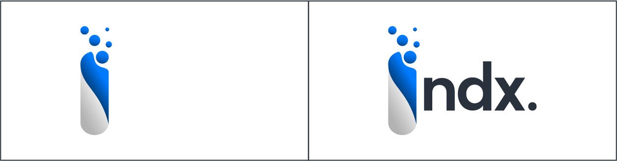
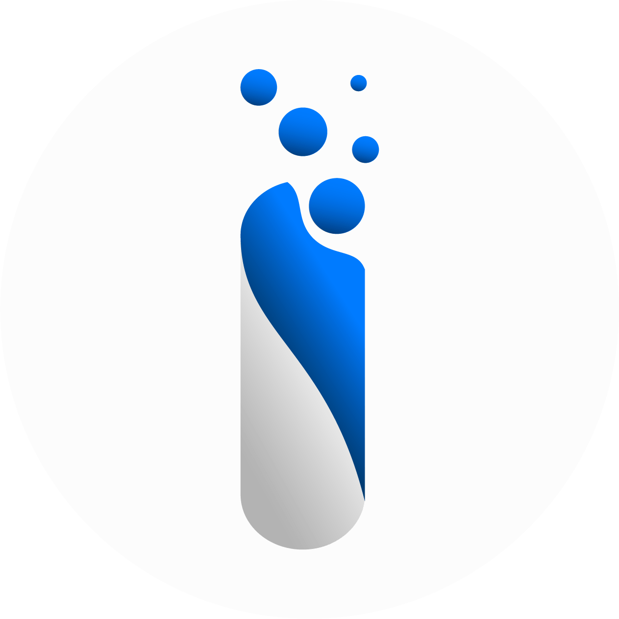
1.1 Logo
The story and use of our logo.
The logo captures the relationship at the heart of K2 Indx. The curved form represents our client, ready to receive and apply knowledge. The falling spheres symbolise insight, experience and clarity being shared and absorbed. As they gather, they create a sense of movement and transformation, showing how understanding deepens through collaboration. It is a calm, confident mark that reflects how we design clarity and deliver confidence.
Remember not to:
- Use logo in monochrome form anymore.
- Scale or distort the logo.
- Use effects (drop shadow etc.).
Clearspace.
The clear space is based on the counter of the K in the logo, as shown in the image. No other objects are allowed inside this area.
All backgrounds can be used behind the logo. However, when placing on top of images it should be positioned on calmer, less distracting areas.
Light & dark.
Depending upon the density of the background colour an alternative colour version is also provided.
1.2 Typography
Our typography has been carefully chosen to reflect clarity, precision, and versatility.
The fonts we use provide a clear and accessible reading experience, ensuring our messages are concise, professional, and easy to understand across all platforms and materials.
Primary & Secondary typeface
Poppins is our go to font. It can be used for headings and body copy alike. It excels in applications that aim at a premium feeling, like invitations and letters. It is used in a variety of weight formats to add emphasis where necessary. Template documents are provided to assist in the understanding of usage.
When considering message heirarchy reduce the font by size by 25% from title to subtitle to body copy to notes and so on.
Where a document is being sent and cannot be controlled, for example in an email, Arial should be used.

1.3 Colours
We have a distinctive colour palette comprised of Deep Ocean, Group Blue, Anthracite, Titanium, Shine, Ivory & Racing Green.
Although our approach to colour is simple, it does mean we need to use it in a single-minded way to ensure brand impact and recognition. This style guide has been created to show the right balance of colour that should be present in our core brand communications.


1.4 Icons
We choose not to use icons as part of our visual identity. This is an intentional decision rooted in our commitment to human-centric communication. Icons can often feel process-driven or overly systematic — and that’s not who we are.
Our brand is built on meaningful, direct communication that speaks to the individual needs of our clients and their people. By focusing on clear language, thoughtful design, and purposeful messaging, we ensure our communication feels personal, tailored, and reflective of the care and attention we bring to every client relationship.
In place of icons, we rely on clear typography, carefully selected imagery, and elegant layouts to guide our audience through information — always keeping the human at the center of the experience.
1.5 Imagery
Imagery helps us express who we are.
Every image should reflect our values of human centricity, excellence and curiosity. The overall feel is aspirational, authentic and composed.
Choose images with intent. Visual storytelling should work with our messaging to build trust.

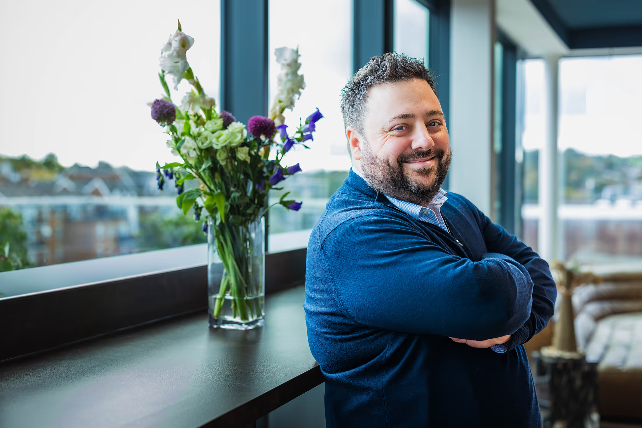
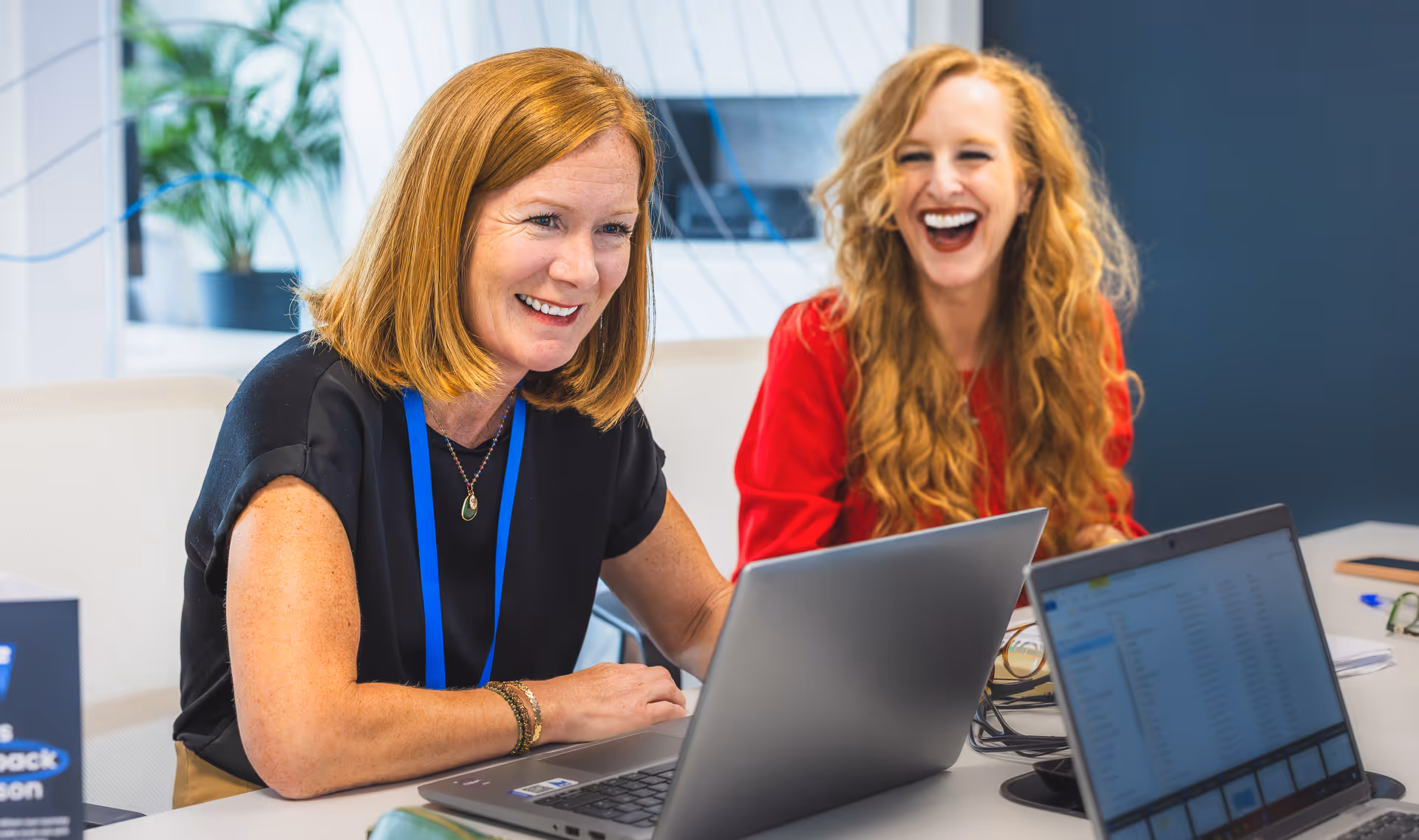
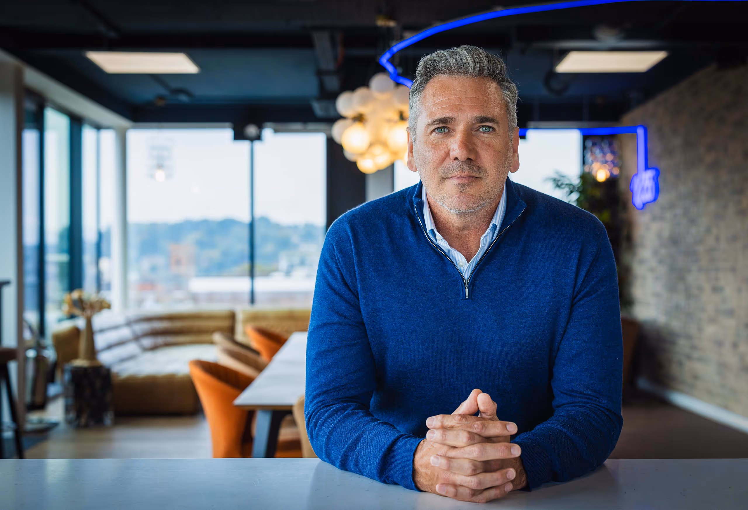
Our People.
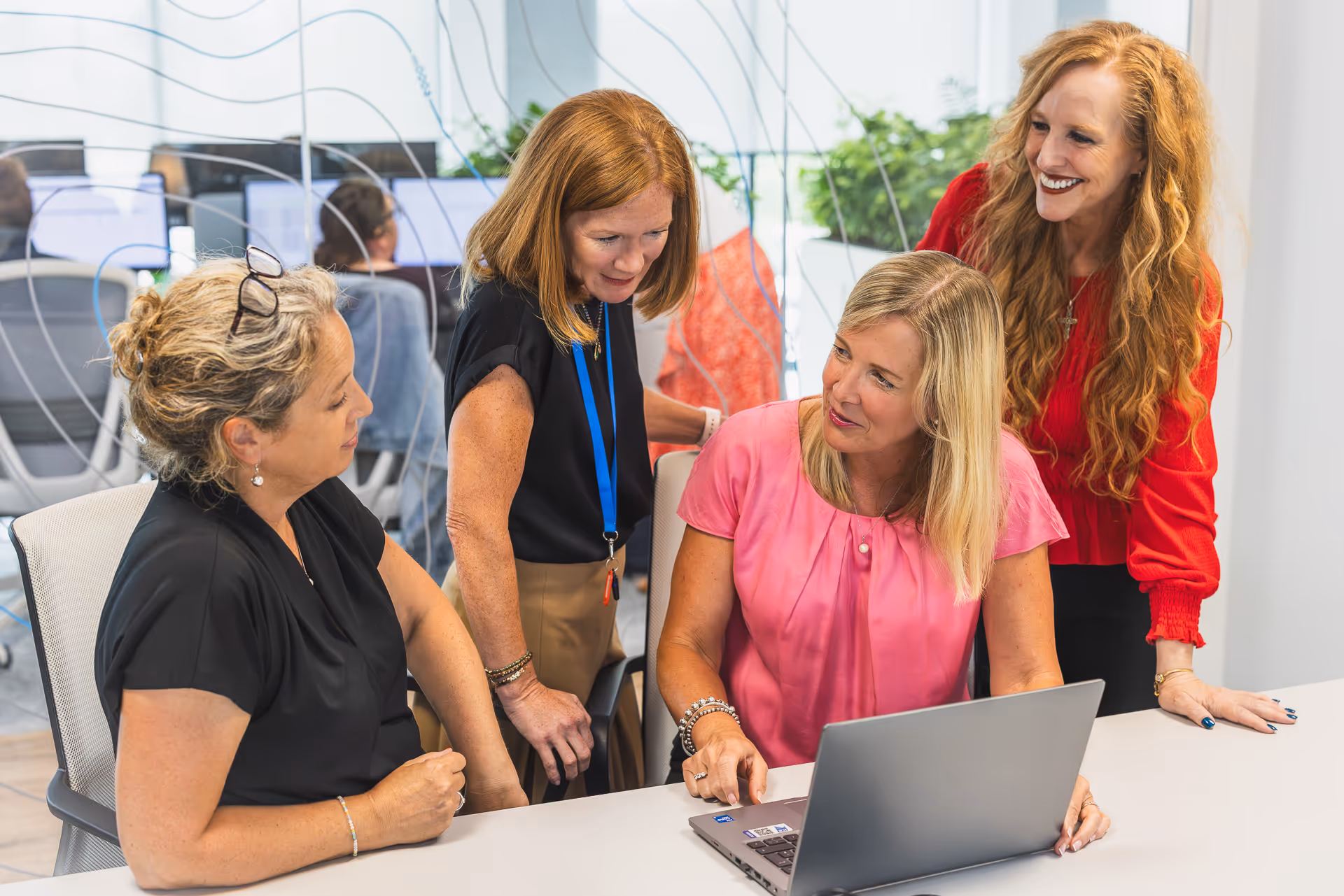
Our imagery of people focuses on the individuals who define K2 Indx. We show advisors who are approachable, experienced and engaged in their work. Expressions are natural, environments are genuine and the tone is confident but unforced.
We avoid overly staged or corporate poses. Instead, we capture moments that reflect collaboration, concentration and connection, the quiet assurance that comes from people who know their craft. Each image should suggest expertise shared openly and work done with care.

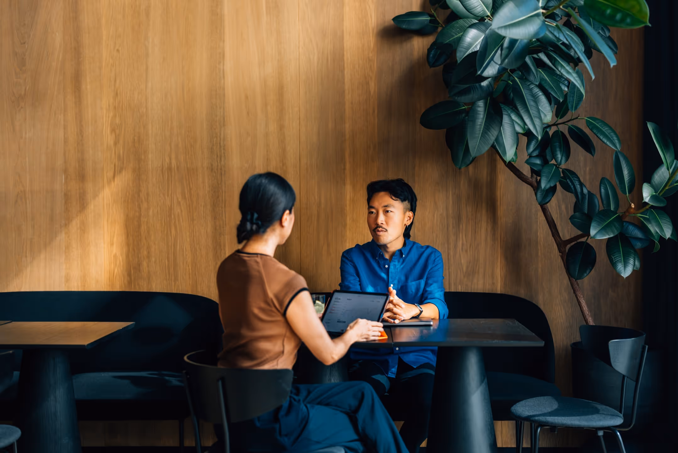
Our Clients.
When we show clients, we focus on partnership and progress. We portray real situations: teams in conversation, individuals exploring ideas, moments where insight is exchanged.
Client imagery should feel respectful, diverse and grounded in authenticity. It represents organisations seeking clarity and growth, supported by trusted advisors who understand their world. The atmosphere is professional, optimistic and calm, the visual equivalent of confidence.
1.6 Image hierarchy
Our imagery isn’t just decoration — it’s a key part of how we take our audience on a carefully curated visual journey.
Our visual narrative depends on balance. We show both sides of the relationship: the experts who bring structure to complexity and the clients whose challenges shape our work. When our people and clients appear together, the connection should feel natural and purposeful, two sides of a shared pursuit of understanding.
This balance reminds viewers that K2 Indx is not simply a consultancy, but a partnership built on dialogue, trust and collaboration. Every image should reinforce that clarity is not something we deliver alone; it is something we create together.

1. Sphere graphics. These abstract forms introduce the idea of knowledge in motion, representing insight being shared and clarity taking shape.
2.Our people. Images of our team show expertise, collaboration and genuine human connection — the foundation of every partnership we build.
3.Our clients. Client imagery captures progress and purpose, reflecting how organisations grow through trusted relationships and shared understanding.
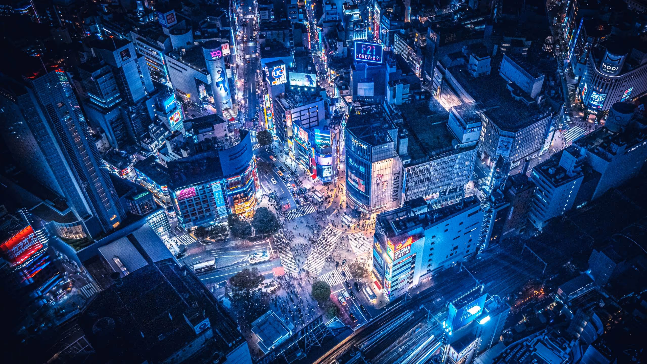
4.Our world, These wider contextual images give scale and atmosphere, situating our work within a connected, global landscape that grounds everything we do.
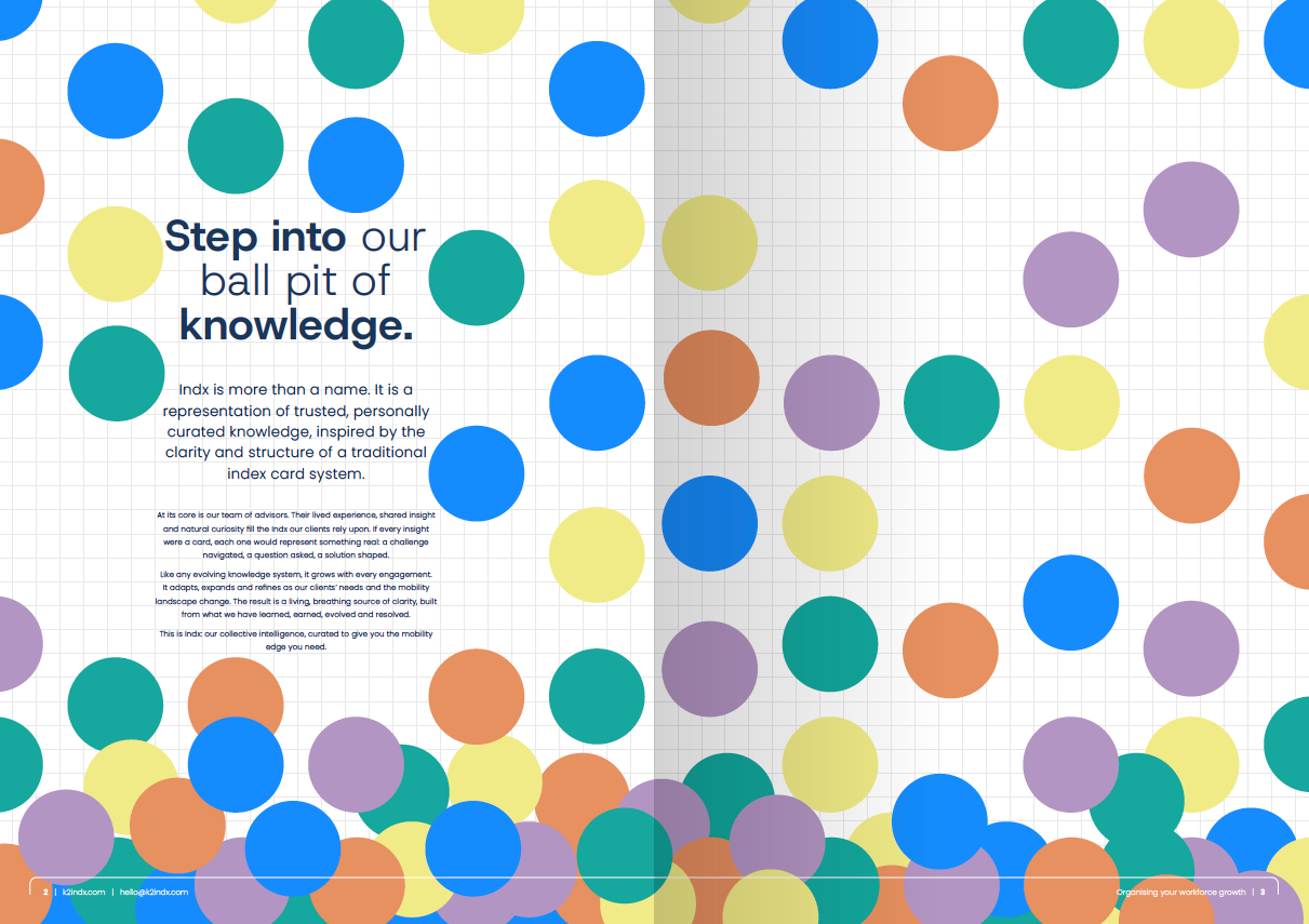
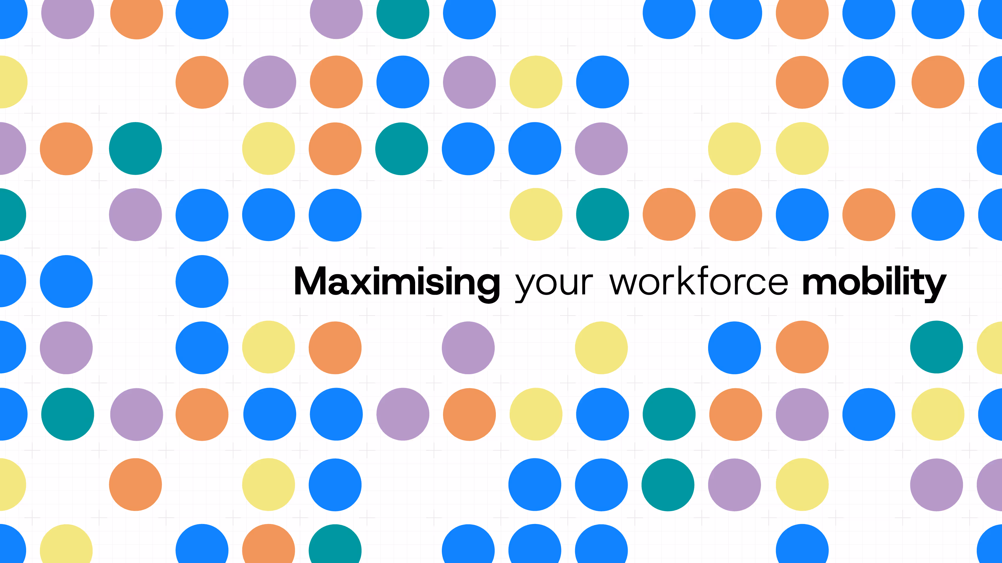
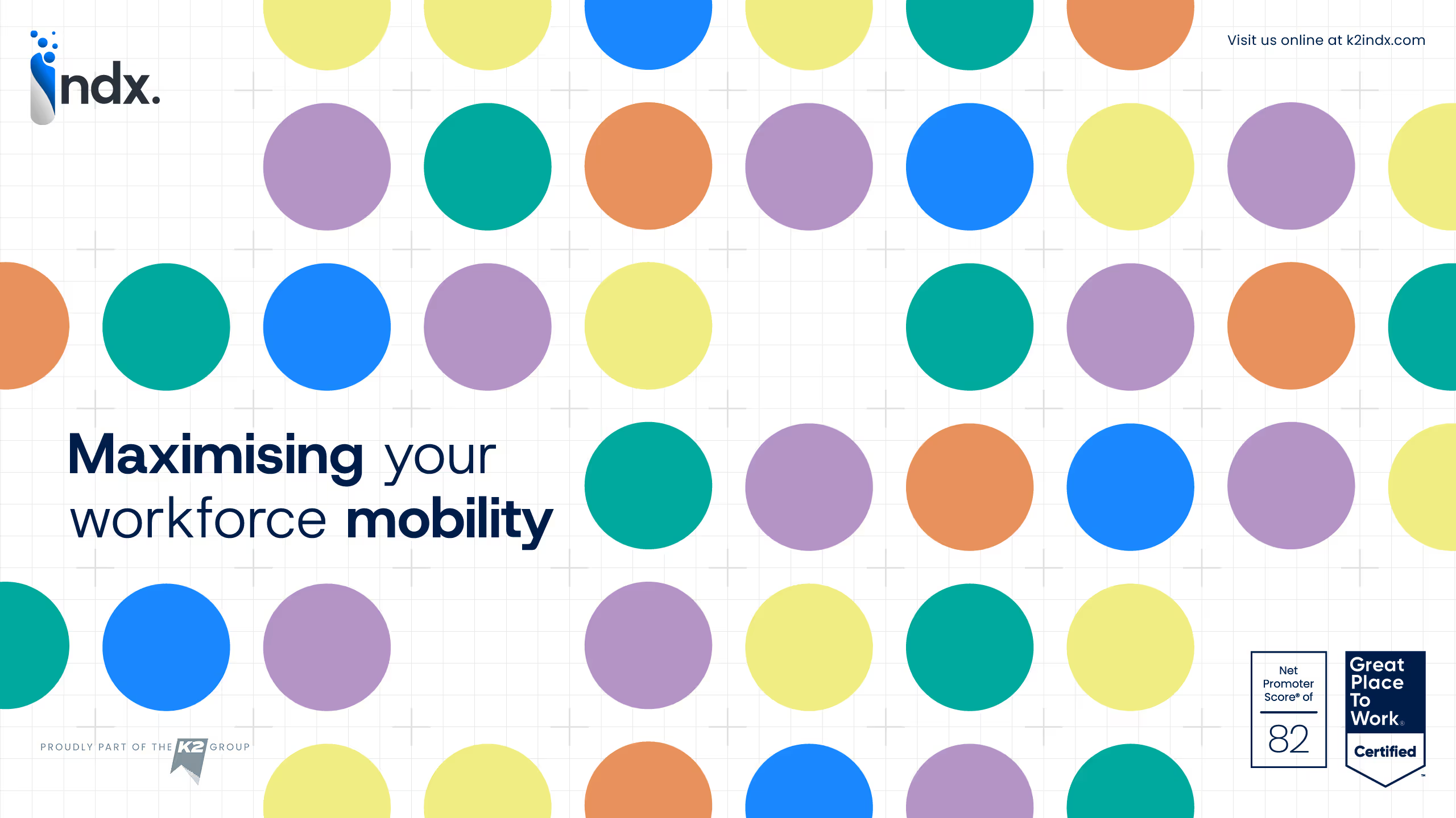
1.7 Patterns
Our pattern system is built from the same visual language as our logo — a composition of spheres and a precise underlying grid. Together, they represent how we bring structure to complexity.
The grid reflects the frameworks we create for our clients: ordered, measured and intentional. It provides stability and alignment, a quiet structure that keeps ideas grounded and direction clear.
The spheres represent knowledge — insight drawn from experience and shared with purpose. As they move across the grid, they show information becoming understanding, data becoming design, and complexity resolving into clarity.
When used in combination, the grid and spheres visualise the essence of K2 Indx: logic and humanity working together. The result is a pattern that feels alive, evolving and intelligent — a subtle reminder that our work is always in motion, always learning, and always guided by structure and intent.
Used sparingly, these patterns add depth and continuity across our communications, connecting every touchpoint back to our purpose: to design clarity and deliver confidence.

2.0 Brand voice
How we write matters as much as how we look. Our voice is human, precise and useful. It should help the reader understand, decide and act.
Every word should feel tailored and confident. This section explains our goals and principles, how voice differs from tone and where we bend the rules to sound like K2 Indx.
2.1 Writing goals & principles
Our writing extends our service. It informs with clarity, engages with warmth and earns trust.
Goals
- Guide with confidence. The reader should feel in expert hands.
- Connect on a human level. We write for people, not processes.
- Convey high standards. Care and attention show in the details.
Principles
- Be clear, not complicated. Keep structure simple and language plain.
- Show, do not only tell. Use examples and outcomes where helpful.
- Write with intent. Every sentence serves a purpose.
- Stay human. Processes exist to support people.
We adapt tone to context. Proposals, onboarding guides and social posts require different levels of formality. The core voice remains the same: clear, calm, considered and distinctly K2 Indx.
2.2 Our voice
Our voice reflects who we are. Expert, human and composed. We speak with clarity and confidence, supported by empathy.
Our voice is
- Human and empathetic. We recognise the personal nature of mobility.
- Clear and confident. We guide without jargon or noise.
- Reassuring and solutions focused. We frame what is possible.
- Elegant, not stiff. Professional and approachable.
- Creative and thoughtful. Small touches can lift the experience.
At every touchpoint, our voice should remind our audience why they choose K2 Indx.
2.3 Our tone
Tone shifts by task, audience and moment.
Before writing, we ask ourselves:
- What is the purpose of this message? Are we informing, reassuring, inspiring, or guiding?
- Who is the audience? Are we speaking to a client, an assignee, or a partner?
- Where is the reader in their journey? Are they exploring options, preparing for a transition, or in need of immediate support?
Why should they read this? Is it essential information, or are we deepening engagement? - How will they receive it? The medium matters—emails, presentations, reports, and face-to-face conversations each require a nuanced approach.
Adapting Our Tone
Introducing K2 Indx
Elevated and invitational. We highlight the experience and outcomes we create.
Guiding and supporting
Clear, reassuring and human. We acknowledge complexity, then show the path.
Sensitive situations
Transparent and empathetic. We handle change and challenge with care.
Across channels, tone should feel intentional, appropriate and aligned with our promise to deliver confidence.
2.4 Writing about K2 Indx
Write about us with honesty and restraint. We balance pride with humility.
Referring to ourselves
Use “we” in most contexts. In formal writing such as press releases, begin with “K2 Indx” for clarity, then move to “we”.
Talking about our people
Our people are advisors and problem solvers. Credit teams for outcomes. Emphasise collaboration over hierarchy.
Signing off
For external emails:
Best wishes,
The K2 Indx Team
Our global perspective
We serve a global audience. Use inclusive language that travels well.
Style and personality
Warm yet professional. Confident, never boastful. A light touch of wit is welcome where appropriate.
2.5 Grammar, conventions & rules to break
We write the way real people speak, with clarity, elegance, and a natural rhythm. We’re humans talking to humans — our writing should feel effortless to read and unmistakably ours.
Our Essentials
- We favour clear over clever. No jargon, no unnecessary complexity.
We use contractions. We’re not overly formal — so it’s “we’re”, not “we are”, and “you’ll”, not “you will”. - We write in sentence case. Except when naming official products, services, or proper nouns, which follow the correct styling.
- We use British English. That means “organisation” not “organization”. However, if writing for a US audience, we adapt accordingly.
Punctuation & Flow
- We’re not scared of starting sentences with “And” or “But”. Because that’s how people speak.
- We break long sentences into shorter ones - for clarity and impact.
- We embrace white space. It gives our words room to breathe, especially in presentations and online.
Writing for Scanability
- Headings and subheadings matter. They should guide the reader — not confuse them.
- We love a well-placed bullet point. Especially when simplifying complex information.
Rules We’re Happy to Break
- We split infinitives if it sounds better. We’ll gladly “boldly go” rather than “go boldly”.
- We’ll start sentences with “Because”. Sometimes, it’s the most natural way to explain something.
- We keep it short whenever possible. Especially on social media, in headlines, or in captions.
2.6 Our tone in short
We respect the rules of good writing — but we break them when it helps us sound more like K2 Indx.
- Polished but human.
- Confident but not boastful.
- Elegant but never stiff.
- Simple but never basic.
- Curious but always clear.
3.0 Brand activation
Our brand comes to life when it connects with people across different touchpoints. This gallery showcases how our identity works in practice - elevating every interaction with elegance, precision, and a human touch.
These applications are not just examples; they are a source of inspiration, guiding us to communicate the K2 Indx experience in a way that is seamless, aspirational, and unmistakably beyond exceptional.
This is how we bring our brand to the world:
3.1 Presentations, guides & templates
Consistency is key—every presentation, guide, and template should reflect the same precision, care, and excellence we bring to our real-world service. By dotting every i and crossing every t, we ensure our digital presence is as seamless, polished, and beyond exceptional as the experience we deliver.
Powerpoint
We use Powerpoint to present easy to digest content in person or on screen. Powerpoints files should never be emailed, they are fact based and lack the personal touch we delivered at K2 Indx. Please ensure all copy and font guidance is followed.
Word documents
Use for documents that will be read and referenced. Follow hierarchy and style rules.

3.2 Brochure
The K2 Indx brochure is a curated introduction to who we are and what we stand for. It brings together our story, our people and our purpose, showing how insight, experience and clarity combine to shape the work we do. Each page is designed to guide the reader through the principles that define K2 Indx, our human-first approach, our strategic depth and our commitment to creating certainty in complex environments. The language is clear and composed, the visuals deliberate, reflecting the calm confidence that sits at the heart of our brand.
More than a presentation of services, the brochure is a statement of intent. It illustrates how we partner with global organisations to transform complexity into structure, and information into understanding. It captures the essence of collaboration, the exchange of knowledge that helps clients move forward with confidence. Every element, from design to tone, mirrors the way we work: precise, thoughtful and grounded in the belief that clarity is not just delivered, it is designed.

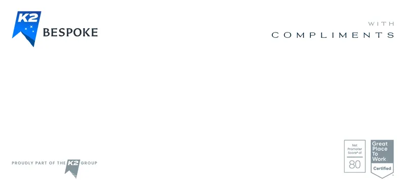
3.3 Stationery
Our stationery represents elegance & simplicity. It seamlessly adapts to formal occasions in both print and digital formats. Whether it’s a printed letter or a digital document, our stationery ensures that every communication reflects the precision, professionalism, and beyond exceptional standard of K2 Indx.
Letterheads
These are provided in both A4 and legal size formats.

Address labels & note cards
Address labels are produced in A5 sizing, notecards are produced in A5 sizing. Both carry our brand marks.
3.4 Socials
Our presence on social media should reflect the same exceptional service, knowledge, and personal touch that define K2 Indx. Every interaction is an opportunity to showcase our expertise, accessibility, and commitment to adaptability.
All socials company profile image
The K2 Indx logo is shown as the icon only and placed on our Deep Ocean background.
Personal profile photograph
Your LinkedIn profile image should be professional yet approachable—well-lit, high-quality, and reflective of the polished, personable nature of K2 Indx.

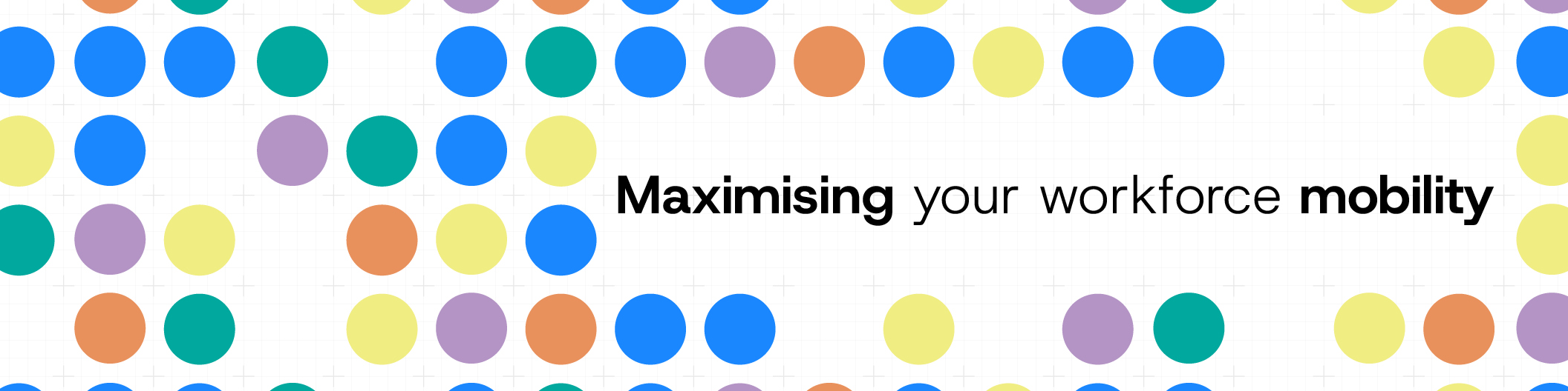
Business LinkedIn hero banner
Our business banner features the K2 Indx grid and sphere design. It is a visual expression of structure, clarity and knowledge in motion. The phrase "Organising your workforce growth" anchors the message and reinforces our purpose and the value we bring to clients worldwide.

Personal LinkedIn hero banner
The personal banner reflects our brand aesthetic through the grid and coloured spheres, creating a sense of calm, precision and thoughtful energy. It includes the K2 Indx logo and the statement "Organiser of workforce growth", connecting each individual profile to our collective mission and the wider K2 Group.
Business X hero banner
Our X banner applies the same grid and sphere imagery, capturing the dynamic nature of K2 Indx in a simple, intelligent visual. The headline "Organising your workforce growth" communicates focus and intent, ensuring our brand presence remains clear and consistent across all digital platforms.

YouTube banners
Our YouTube banners extend the K2 Indx visual identity across motion and film. The combination of grid lines and coloured spheres conveys structure, movement and shared insight, while the "Organising your workforce growth" message connects every piece of content back to our purpose. Multiple layouts are available to suit different formats and playlists.
3.5 Presenting oneself
In the digital landscape, consistency is key to reinforcing the K2 Indx brand. A unified presence across Teams, email, and social platforms enhances professionalism and ensures we present ourselves as a cohesive, well-aligned team. Matching Teams backgrounds, professional and consistent profile photography, and a polished digital appearance all contribute to the exceptional standard we uphold in every interaction.
Personal profile photograph
Your LinkedIn profile image should be professional yet approachable—well-lit, high-quality, and reflective of the polished, personable nature of K2 Indx.
Teams backgrounds
Our teams backgrounds are one of our greatest visual assets that are seen audience. There are several designs to choose from, each feature or K2 Indx logo, our Group logo and a humble boost about or Great Place To Work® accreditation and NPS® score.
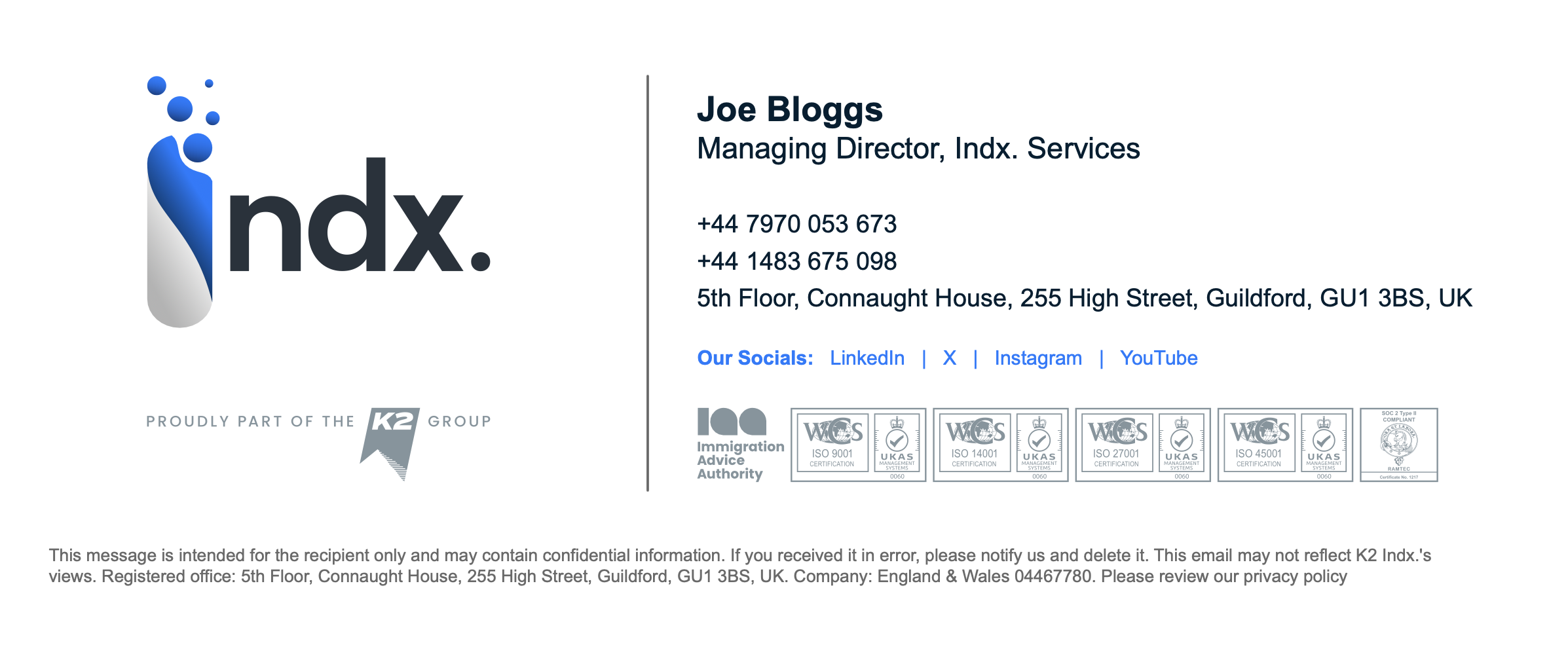
Emails & signatures
Your email address is automatically generated and contains personal contact information in addtion to links to our dedicated social media channels. If for some reason your email signature is not displayed correctly, please get in touch.
When composing emails please ensure your font is set to Arial 11pt.
4.0 Brand strategy
Our brand is a promise and a plan. It is rooted in human centricity, excellence and insight. It guides how we act, how we communicate and how we raise standards in mobility advisory.
4.1 Our vision
We focus on providing quiet, high-quality support to the people who matter most, our clients. People sit at the heart of our work. We design programmes and deliver projects that support our clients and are tailored to their organisation and culture.
Our goal is simple. Design clarity. Deliver confidence. We work with integrity and follow robust standards such as ISO 9001. Quality is visible in every interaction.
4.2 Our position
We set a standard that others aim for. Our approach is personal, adaptable and purposeful. We do not chase trends. We improve what matters and define what comes next.
This is what it means to be K2 Indx.

4.3 Our purpose
We exist to make complex mobility clear, compliant and human. We deliver seamless, competitive, compliance solutions that go beyond expectations without noise or drama.
Every project we deliver, every challenge we resolve and every policy or programme we shape is built on trust, expertise and genuine care.
4.4 Brand architecture
We operate with a distinct identity within the K2 Group. The Group connection strengthens our reach and capability while we maintain a clear advisory and assign,ment managementfocus. Together we offer a complete spectrum of mobility services, delivered as one joined up experience.

4.5 Because it's personal
Personal is not a slogan. It is how we work. We build relationships, not transactions. We consider details. We design experiences that reflect the trust our clients place in us.
Across K2 Indx and the wider K2 Group, we aim to create human centred experiences that set the benchmark for our industry.
Why Because that is the right way to do things.
